Want to watch House of the Dragon with us? Sign up for our new subscriber-exclusive newsletter obsessively chronicling season two.
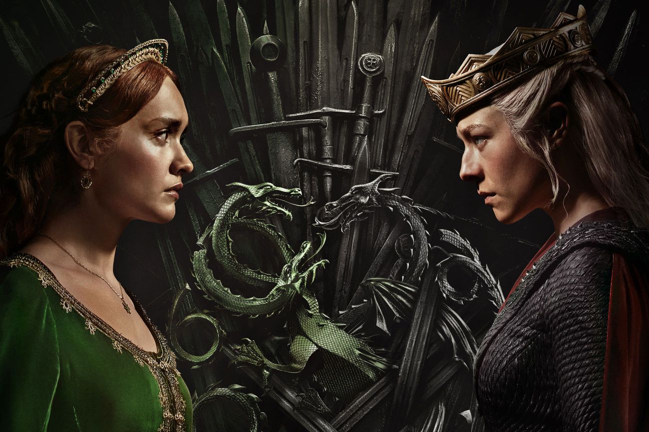
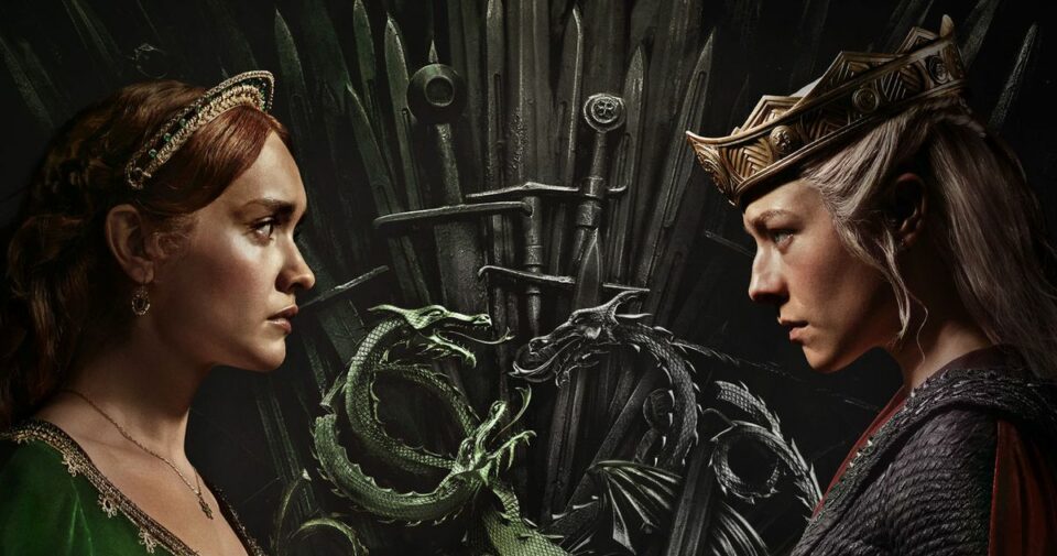
There’s nothing wrong with an excessive corporate-marketing budget to create #viral moments around pop culture. Giant media investment in algorithms and the age of too much content have driven us apart, and it’s only fair that networks be forced to use wild budgets spent on massive consumer awareness in order to bring us back together again. It worked for Barbie. It can work for House of the Dragon, too! The problem with hanging enormous digital Team Green (Alicent Hightower) and Team Black (Queen Rhaenyra Targaryen) banners around the world (well, New York City, Brazil and Mexico so far) is not that it’s turning our shared physical reality into a giant empty billboard for sponsored content. The problem is the colors themselves.
The green is not green enough. The black is fine, except that especially under certain lighting conditions, it looks VERY similar to dark green. If you’re going to blanket the world with your “Raise the Banners, Pick a Side, Whose Team Are You On?” marketing campaign in order to drum up interest for your show about one lady with dragons seeking revenge against another lady with dragons who is also seeking revenge, then the banners should be legibly different colors at more than one time of day! You know who didn’t have this problem? Barbie. That pink was pink. And it worked!
What they need is a swift rebrand. Sure, they’ve already poured all this money into Black and Not Black But Pretty Close merchandise, but it’s never too late to admit a mistake. One option is to go in and make every green background just a few clicks brighter on the color wheel (they’re currently around a Pantone 350 C, and I’d move them closer to a 348 U) but that would mean throwing out all their current cool banners and probably reshooting most of House of the Dragon season two.
Thankfully there’s an even easier solution here, which I am sure Warner Bros. will embrace immediately after reading this blog: Change the team names. They don’t need to change any of the designs or shift strategy at all. They just need to reprioritize the accent colors, which are already present in all of marketing. If you go into this whole thing with the understanding that Team Green is actually Team Gold and Team Black is actually Team Red, then it’s much easier to keep everything straight. The banners already feature those colors, which are much more distinctive than the background tones. Red and gold are just as regal but also just as ominous as green and black (red is for blood!). There’s no overlap with the Green & Black’s fancy chocolate company. It doesn’t map perfectly onto “song of ice and fire” without having to awkwardly argue that ice is gold, but look, I’m sure someone out there knows a fun Game of Thrones motto that will fit. And most importantly, people will be able to tell what banner represents what side of this conflict without having to squint into the sun and cause traffic problems.
The Brooklyn Bridge has been claimed for King Aegon II.#TeamGreen#RaiseYourBannerspic.twitter.com/Eb1Pht5aJw
— Game of Thrones (@GameOfThrones) June 10, 2024
The Manhattan Bridge is for those loyal to Queen Rhaenyra. #TeamBlack#RaiseYourBannerspic.twitter.com/HhSKW1xBD7
— Game of Thrones (@GameOfThrones) June 10, 2024
New York has it bad enough with the congestion-pricing issue. Let’s not make it worse with confusing banners for a spinoff series everyone’s trying to get themselves excited for because it’s the last gasp of monoculture. Team Red versus Team Gold!
Related
- 33 TV Shows We Can’t Wait to Watch This Summer
- House of the Dragon Is Throwing in 5 More Dragons With Season Two
Kathryn VanArendonk , 2024-06-11 19:43:17
Source link


